Ready Bank

 The Briefing was to design a banking app for millennials. That is why I used my best UX/UI techniques to find an optimal and visually attractive solution for this audience.

Rol:

UX/UI Designer

Methodology:

Design Thinking

Date:

2019

Process

The first thing that I did was to organize the tasks and empathize with the problem, in order to find a great solution. The next step was to prioritize the tasks creating a trello, in order to manage myself and divide the steps to optimize the time. 

· Research :          

Briefing – Benchmarking – User Persona –  Empathy Map– User Journey 

· Diseño :          

Prototype Low Fidelity  – Wire Flow – Prototype High Fidelity – Style Guide 

· Validación :          

Testing – Iteration  –  Conclusions

Research

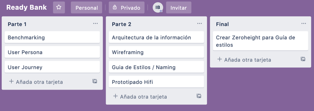
In this point what I did was an intense research of Bank Apps, in order to see what solutions were they offering and how they faced to similar problematics.

The Apps that I analyzed were:
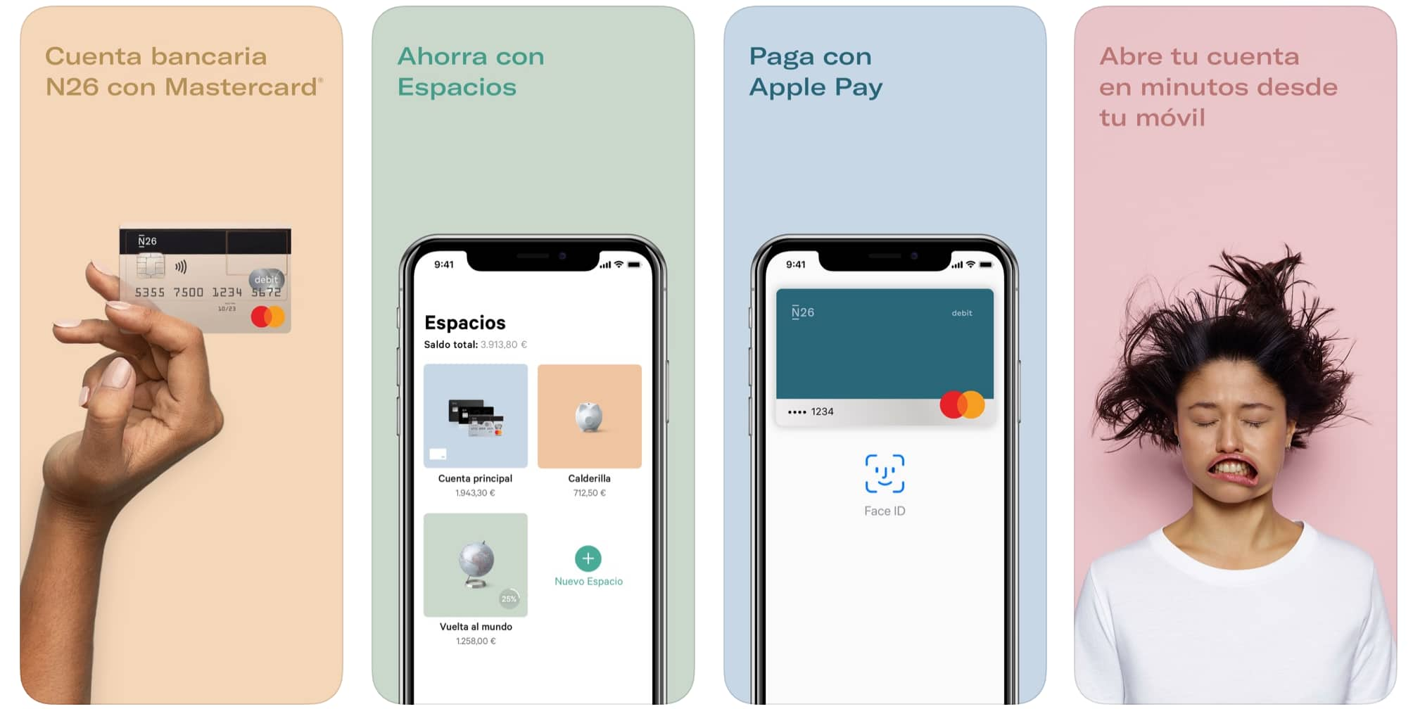
· N26

From this App, what I highlighted most was its youthful touch, since unlike other bbanks it has a language much closer to the target that is focused, to create a visual and written language focused on their final user.
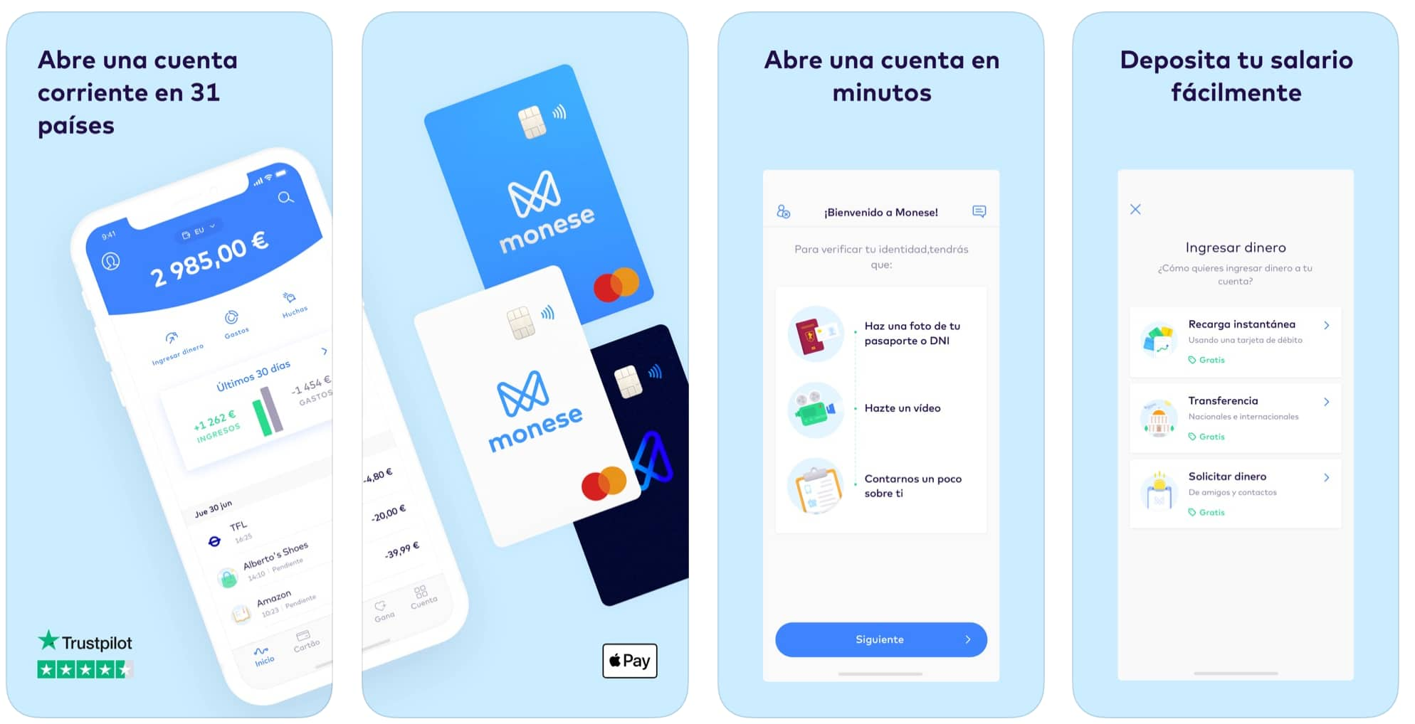
·  Moneese

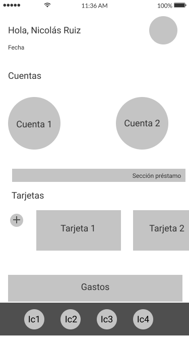
In this case, I thought that it was very interesting the  sections division  that they have, creating a visual effect more similar to a social network, in order to differentiate from other competitors.
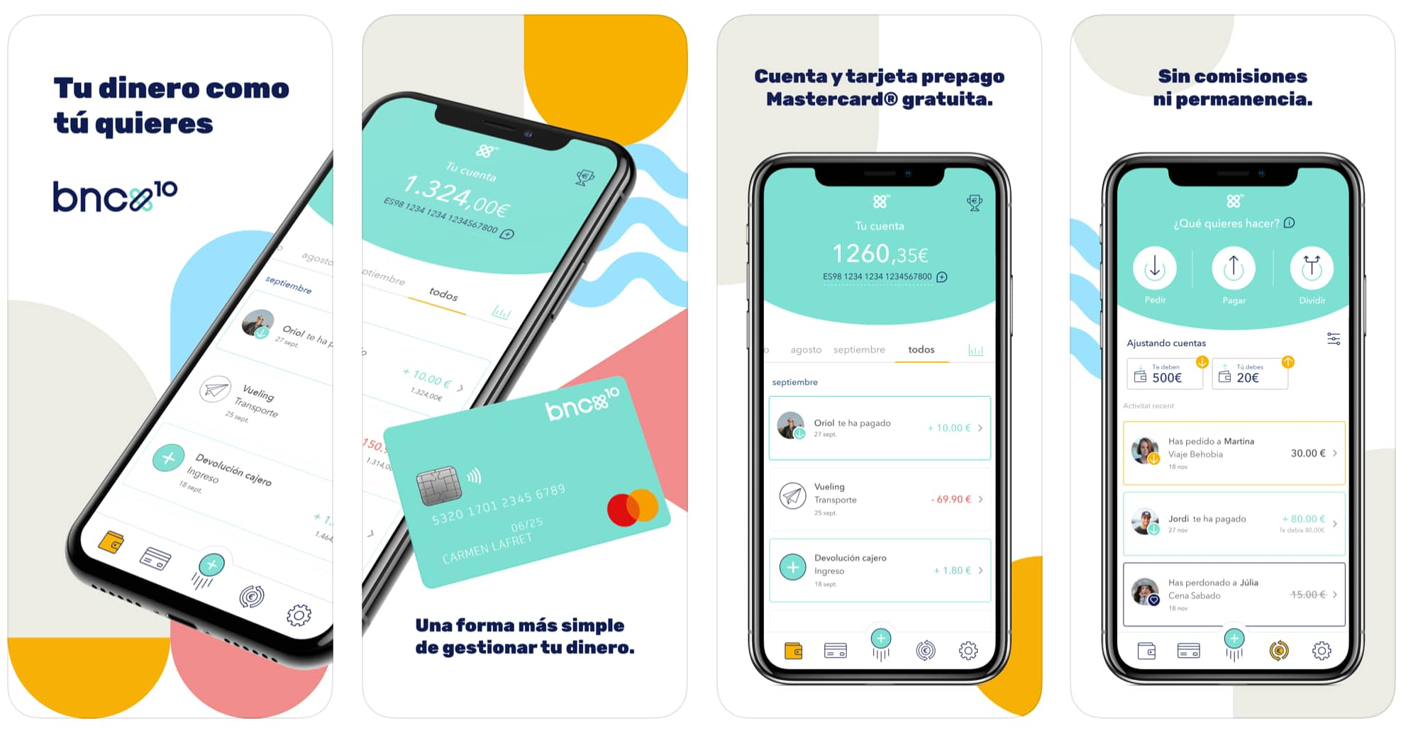
· BNEXT

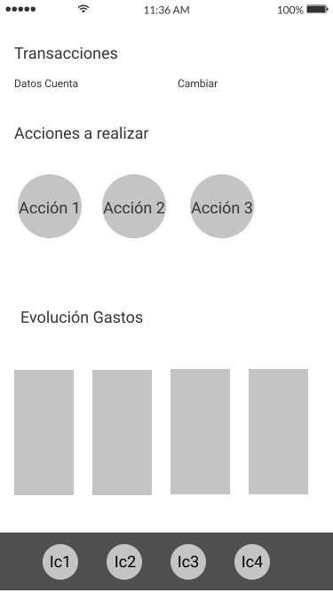
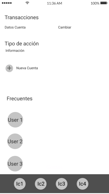
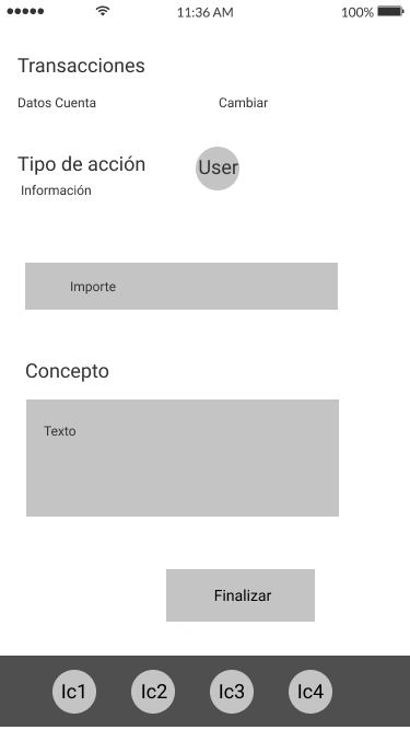
Regarding this App, what I liked the most was how easy it is for the user to make a transfer, and how easy is for the user to make payments or daily actions.

Captura de pantalla 2019-11-26 a las 10.36.46

Empathize

After doing the research, I decided to empathize more with the future users of the App, so I created a User Persona and its User Journey. In order to have a more objective point of view on the case to work.

The User Persona, which I created was Marta Sand, a young woman looking for a bank that is easy to navigate and perform her daily operations.

After the journey, I clearly identified the Pain Points, which were  :

 · Very long and tedious steps.

· It is not clear how to make a transaction.

· Doubtful Architecture Information . 

Information Architecture

The next thing was to do the Information Architecture, to see what sections and steps I was going to carry out to later create the wireframes and the prototype on  high fidelity (with Figma).

I structured it as:


Wireframing

In this part I did the wireframing, to rank the sections and contents, before making the version in high fidelity.


Style Guide

To start I created the naming «Ready Bank», because »Ready» is a youthful term,that is used for english people and for others from another countries. 

As claiming I used «The easiest Smart Bank» debido a su facilidad de uso, y lo rápido que el usuario puede hacer sus acciones dentro de la App. 

For the typography I decided to use Averta Std, because it’s a typography that provides security but at the same time is close and has a more »youthful’ feeling. 

Regarding the color range I decided to use purple as it is a very neutral color and brings freshness to its elements, apart from having a context within the framework of the innovative and technological. As contrast color, I decided to use orange, contextualizing red to its brother color, as a warning color or to cancel an action.


Prototype Hi-Fi

As for the prototype in Hi-Fi, I decided to create it for IOS version.The first thing I did was to create an 8px grid, then I designed the «login» page, to contextualize the previous action and then the dashboard, where the different actions that the user can do. 

I divided the menu into:

· Home 

· Wallet

· Transactions

· Options

I decided to use «Blobs» to give it a more youthful and casual touch, to descontextualize it from the serious touch that the Classic Bank Apps usually have, as well as a much closer UX Copy.

Conclusions

Ready Bank was an interesting project to do, the research phase helped me a lot to synthesize and improve the previous ideas that I had after reading the Briefing, as well as to empathize with potential users and with the product itself.

Apart from that, the Benchmarking helped me as a starting point to structure well the information and contents that I was going to do in my design, having as a reference companies of the same industry that were carrying out similar actions and focused on a similar target.


More info in Medium (Spanish)


View Previous Project


View Next Project