Aliseda

Design System · UX Lead · Product Management

Led the design department and build a consistent Design System & Streamlining Property Listings for Better Conversion.

My role

As Design Lead at Aliseda, I defined the company design system in Figma, providing a scalable foundation for the digital ecosystem.
Ongoing work focuses on growing and optimizing the component library for consistent and efficient design and development.

Skills applied

Design System, Advanced Figma Components, Guidelines and Documentation, UX Design, Visual Design.

Project type: B2C, Web-Responsive
Tools: Figma · Adobe · Jira · Figjam · Confluence
Industry: Property Listing
Duration: 6 months

Context

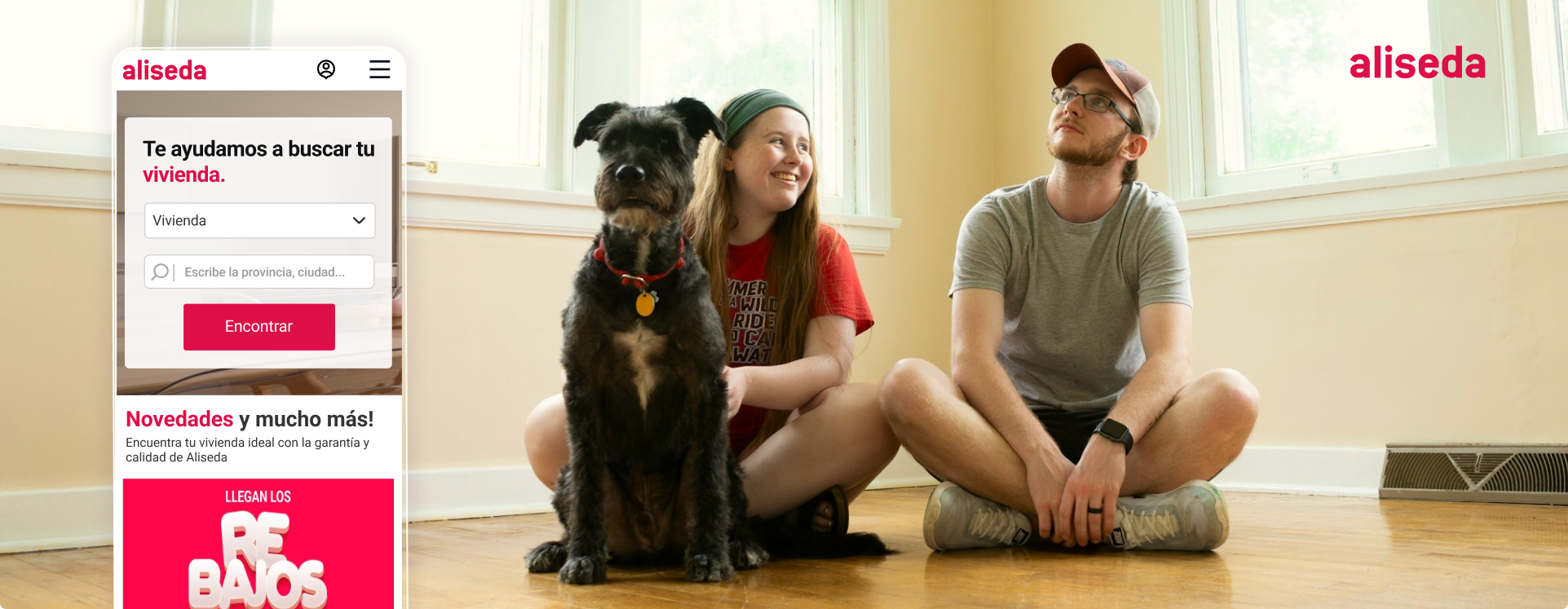
 Aliseda is a real estate company focused on the digital commercialization of residential properties through its web and digital platforms.

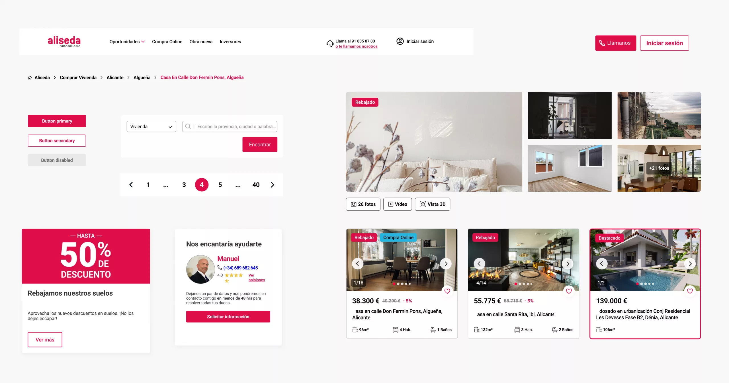
When I joined as Design Lead, the product had grown quickly but lacked a unified visual language and a scalable structure, creating friction between design and development as new features were introduced.

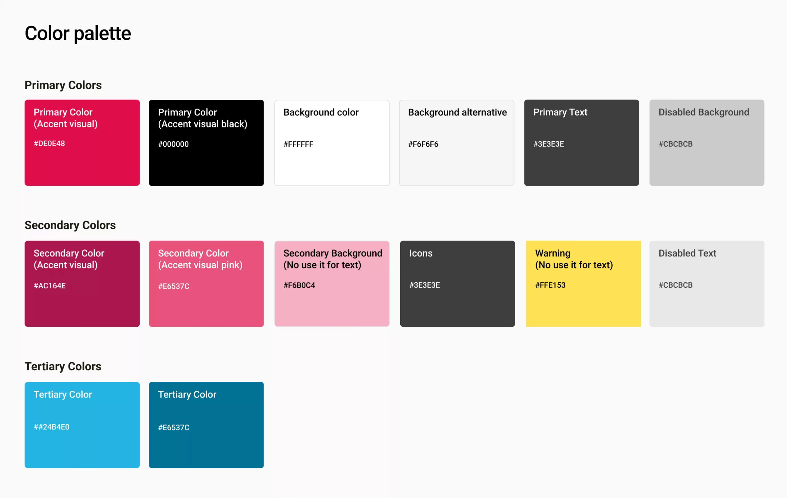
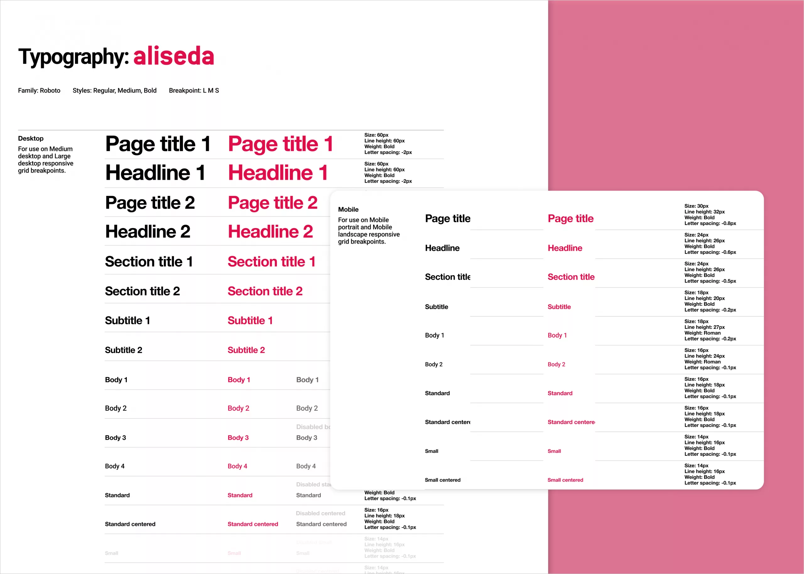
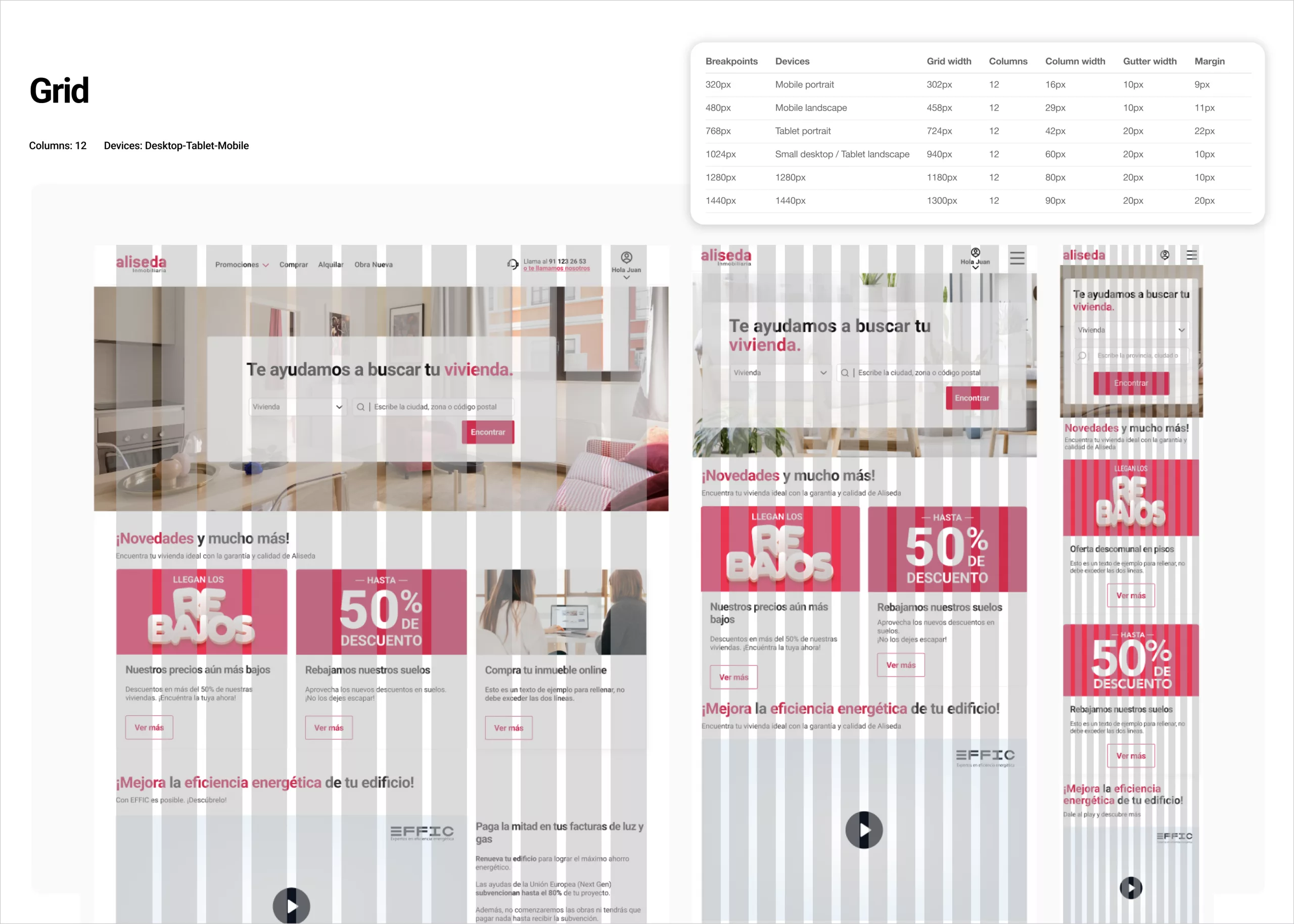
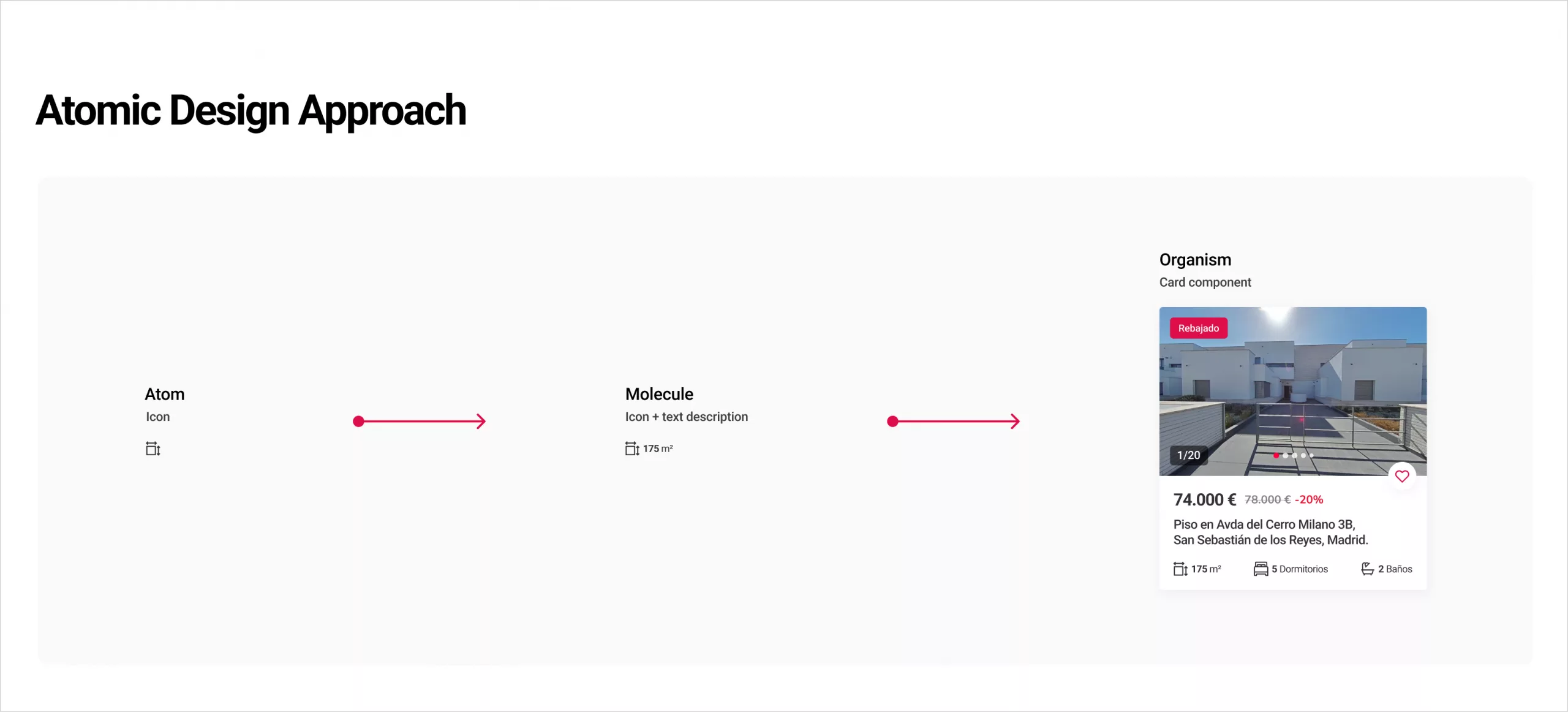
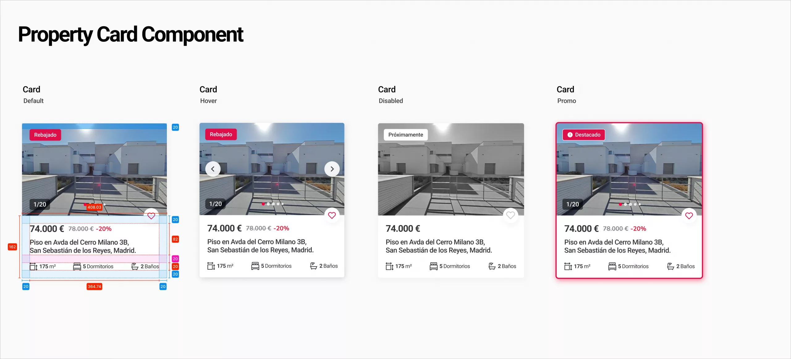
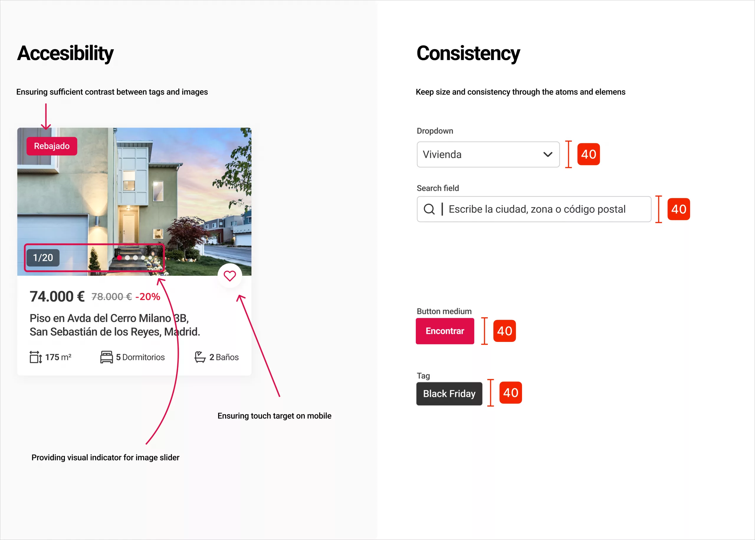
To address this, I led the creation of a token-based design system, defining core foundations such as color, typography, spacing, and elevation, and structuring the UI using atomic design principles. The system became the web’s single source of truth, enabling faster delivery, better collaboration, and a consistent, scalable user experience.

The Problem

 As the App continued to evolve, the lack of a structured design foundation started to generate friction across the product team. 

UI decisions were being made screen by screen, components were duplicated with small visual differences, and design changes required unnecessary effort to implement and maintain.

This situation created three main issues: 

  • Inconsistent user experience across different sections of the App
  • Slower delivery of new features and evolutions
  • High dependency between design and development, increasing QA effort and rework
  • Without a shared system, scaling the product while maintaining quality became increasingly difficult.

Design System Strategy

 The design system was conceived as a product, not just a visual library. It needed to be flexible, developer-friendly, and easy to adopt by the design team.

Token-Based Foundation

 The design system was conceived as a product, not just a visual library. It needed to be flexible, developer-friendly, and easy to adopt by the design team.

I started by defining design tokens as the core layer of the system. These tokens represented the smallest, most fundamental design decisions and allowed visual changes to scale efficiently across the App. 

Tokens included:

  • Color (brand, semantic, neutral states)
  • Typography (font families, sizes, weights, line heights)
  • Spacing and layout units
  • Border radius and elevation
  • Interaction states (hover, active, disabled)
  • This abstraction ensured that design decisions were systematic rather than manual, making updates faster and less error-prone.


Atomic Design Structure

 To ensure clarity and scalability, the system was structured following Atomic Design principles:

Atoms

 Basic UI elements such as:
  • Colors 
  • Typography styles 
  • Icons
  • Buttons
  • Input fields
These atoms formed the visual and functional foundation of the system.

Color palette

Typography

Example of grid for Desktop, Tablet, Mobile

Molecules

 Combinations of atoms that created more complex UI patterns:
  • Form fields with labels and helper text
  • Property cards
  • Filter elements
  • Navigation items

Example of atomic design

Components & Patterns

Reusable components designed for real product use cases:

  • Property listing cards
  • Image galleries
  • Contact and visit request modules
  • CTA blocks and banners
  • Each component was designed with flexibility, accessibility, and responsiveness in mind.

Example of card component variants for desktop

Examples of accessibility and consistency 

Illustrations

 Illustrations played an important role in reinforcing Aliseda’s digital brand and enhancing the overall user experience. For that reason, the illustration style was defined as an integral part of the design system, rather than as standalone visual assets.

Given the functional and informative nature of the product, the illustration style was designed to be clean, clear, and purposeful. I opted for subtle details, and a controlled color palette aligned with the brand tokens. This approach allowed illustrations to support the interface without overwhelming it, adding visual warmth and clarity while maintaining consistency with the Web’s UI.

Examples of illustrations

Collaboration with Development

 A critical part of the process was close collaboration with developers. The design system was built to align directly with front-end architecture, making components easier to implement and reuse.

 Key practices included:

  •  Shared naming conventions between design and code
  •  Clear documentation of component behavior and states
  •  Continuous QA to validate design-system compliance

 This approach significantly reduced implementation inconsistencies and improved delivery speed.

Results & Impact

Established a single source of truth for the App, improving consistency across all digital touchpoints.


  • Reduced design and development time for new features by enabling component reuse and token-based updates.
  • Improved collaboration between design and development, minimizing rework and QA effort.
  • Enabled faster and safer iteration on key product areas, including the property listing and detail pages.
  • Created a scalable foundation that supports ongoing product evolution and future redesigns.


  View Previous Project
  View Next Project