Mube

Mube is a streaming platform to unify all the consoles and games in just one device.  Following the revolution of streaming platforms as Netflix, Hbo or the new born of Google »Stadia», it was my principal objetive to follow the steps of this companies and analyze them in order to make a great product . Utilizing the best UX/UI practices, it was my goal to make a functional and beautiful prototype.

Role:

UX/UI Designer

Metodology:

Design Thinking

Date:

2019

mube background

Process

The first I did was to organize and define what research steps I was gonna make  so I created a Trello, in order to organize the tasks that I had to do in the next 2 weeks. 

· Research :          

Briefing – Research Questions – Desk Research – Netnography – Benchmarking – Focus Group – Experts Interviews – Questionnaires 

· Analysis :          

User Persona –  User Anti Persona – User Journey – Insight 

· Ideation :          

Benchmarking –  MoSCoW – Site Map – User Flow

· Design :          

Wireframes – Style Guide – Prototype Low Fidelity  –  Prototype High Fidelity   

· Validate :          

Iterate  –  Analyze Results  

Research

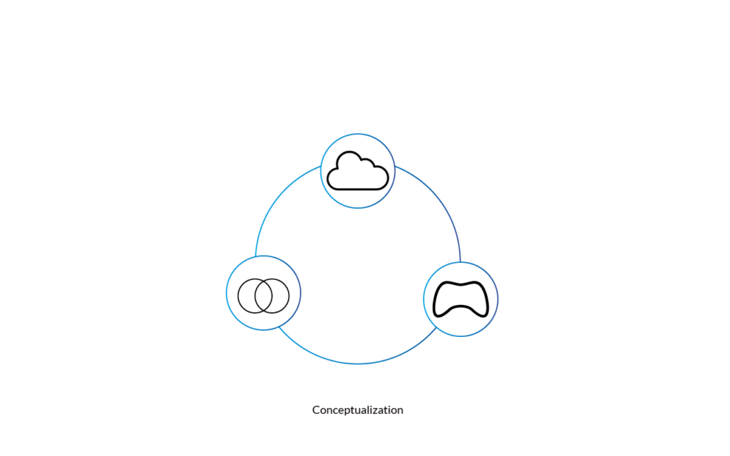
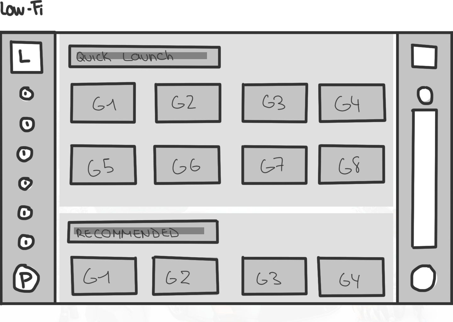
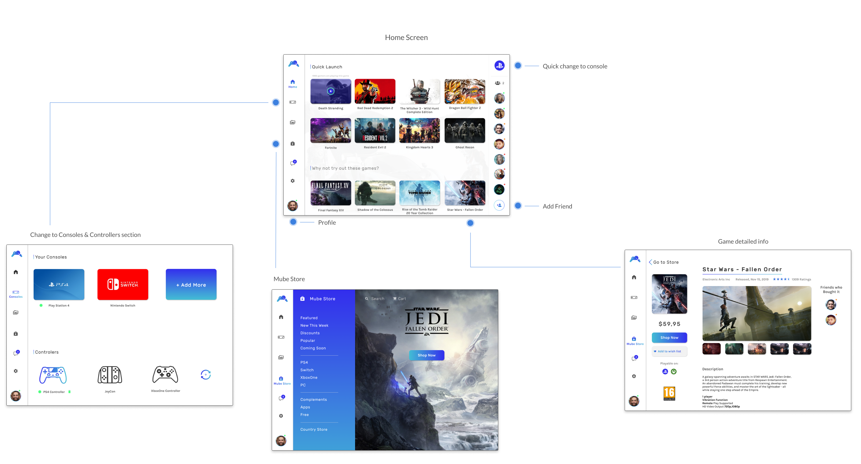
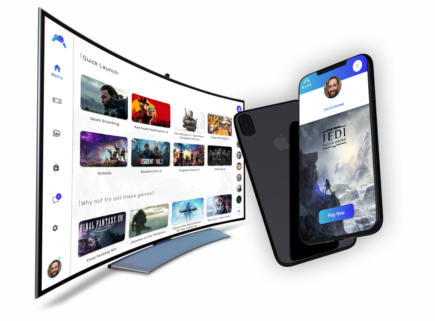
I started defining my project, which was how to create a platform that unify all the consoles and won’t contaminate, so the answer was clear using the »Cloud». 

So my system like »Stadia» will be able in different platforms, such as a TV (connected through a small device), your PC/Mac, your phone or your Ipad/Tablet. 

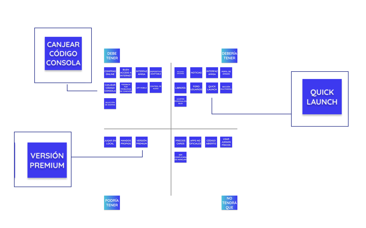
The very first step was to define the Research Questions in order to see what will have my system, some of them were: 

· Could the user buy games?

· Could the user do something if the connection  fails?

After that I looked for some information on internet (Desk Research & Netnography), and discovered some interesting information about the Cloud like: 

· The Cloud services are the future of the technology.

· Disappearance of Hardware.

The next thing I did was the Benchmarking, and analyze the strong and weak points of several companies like Netflix, Apple Arcade, Stadia, Disney +, Nvdia Gforce among others. 

I had the opportunity  to interview two experts in the Cloud Services, this interviews  help me a lot to provide and justify my work.

After that I made two questionnaires one in Spanish and other in English and I put them in different forums and pages of videogames/technology. The conclusions of the questionnaires were positives like:

· A 41% says it’s not a problem to play always online and a 33% says maybe.

· A 49% don’t travel with their consoles for fear to lose them and a 30% for lack of space.

I created a focus group to find some insights about my project and what were the opinions about the Cloud and my new system oriented in consoles and videogames and these were some of the insights:

· It would be beneficial for the environment.

· More safety.


research questions
logos_Bench_Interno

Analysis

To empathize with the users and their needs I created a User and Anti-User Persona.

For the User Persona I created Adrian, a young man who loves videogames and hates when he can not play with his consoles when he’s traveling  for lack of space.

And for the User Anti-Persona I created Mariam, a young lady who likes videogames but hates when people can not enjoy their travels, and people is always with their phones or devices.

A4 - 1
A4 - 2

Ideation

The next step was to create a MoSCoW, and see what must, should, could and won’t have my system.

After the MoSCoW, what I did was to create a Site Map in order to structure my system and see what functions would have and a User Flow to recreate some actions of a user inside the system.

The Procrastination Flowchart@2x
UserFlow

Design

The design process that I make to create the project was to define a name for the project and it was »MUBE» (from the word move and the nube that means cloud in spanish). 

Then I choose the typography which was Rubik for headings because has a youthful and playful vibe and Karla for the body text in order to define a more serious connotation for technical’s specificities. 

The colors that I choose were a blues and purple and a gradient from this colors, the justification is that blue and purple are colors that are directly associate with technology and digital media.

And then I did a wireframes in low fidelity to turn them in high fidelity using Figma and a grid of 12 columns.

Conclusions

The Mube project, was an intense 2 weeks of non stop work, but I have to say that I really enjoyed doing it. There’s some work that I would love to do in the future like a mobile version. But in conclusion this project is ambitious and in order to work I would need the permission of other companies like Nintendo, Sony or Microsoft, and have a method for not being to expensive, because that is one of the problems of Stadia, users complaining about the price, and the extra stuff that they have to buy besides the mensual subscribe. 

More info in Medium (Spanish)


View Previous Project


View Next Project