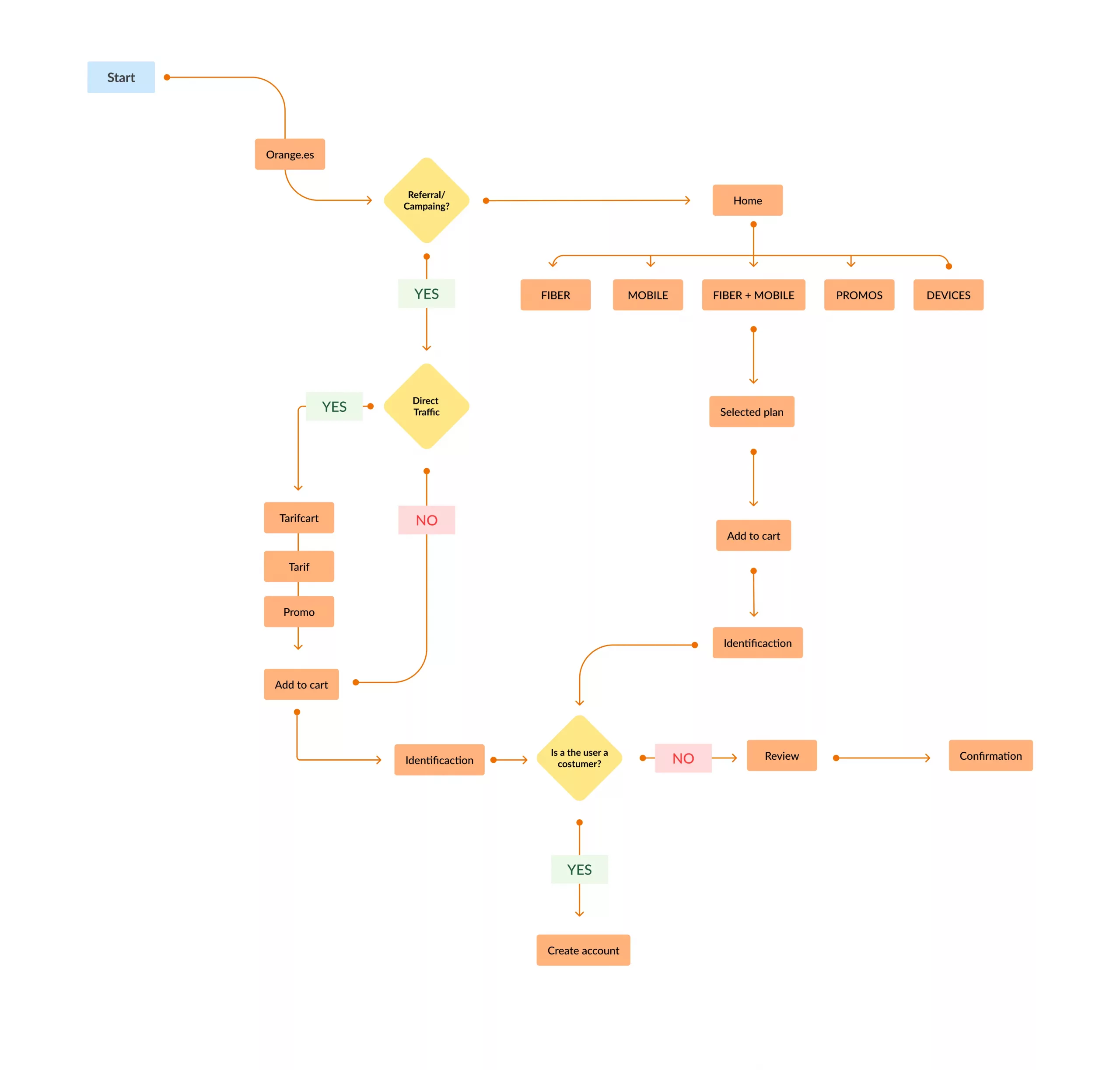
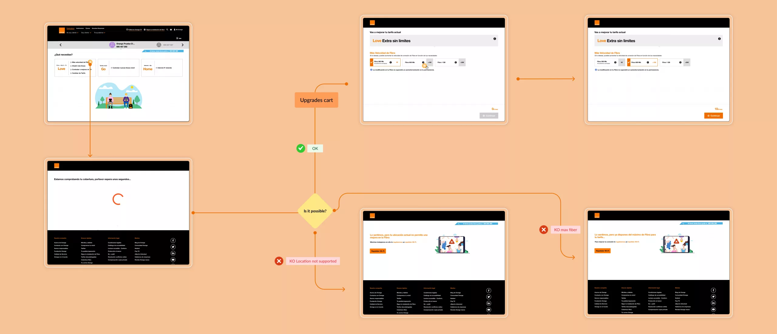
Research activities
 Benchmarking of international telcos Stakeholder interviews (product, marketing, business, dev, legal) User Journeys & Personas Analytics review & heatmap analysis Audit of all existing shopping carts Documentation of technical limitations in legacy systems


 Key outcomes
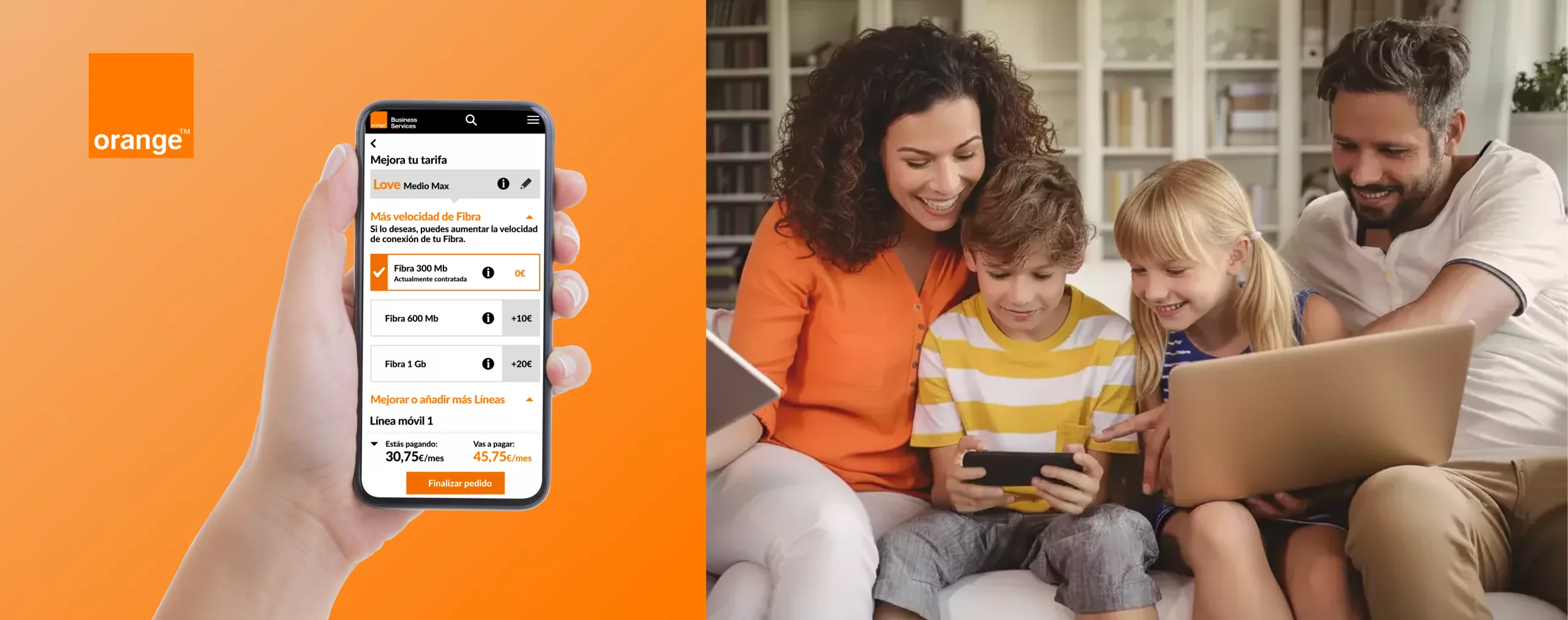
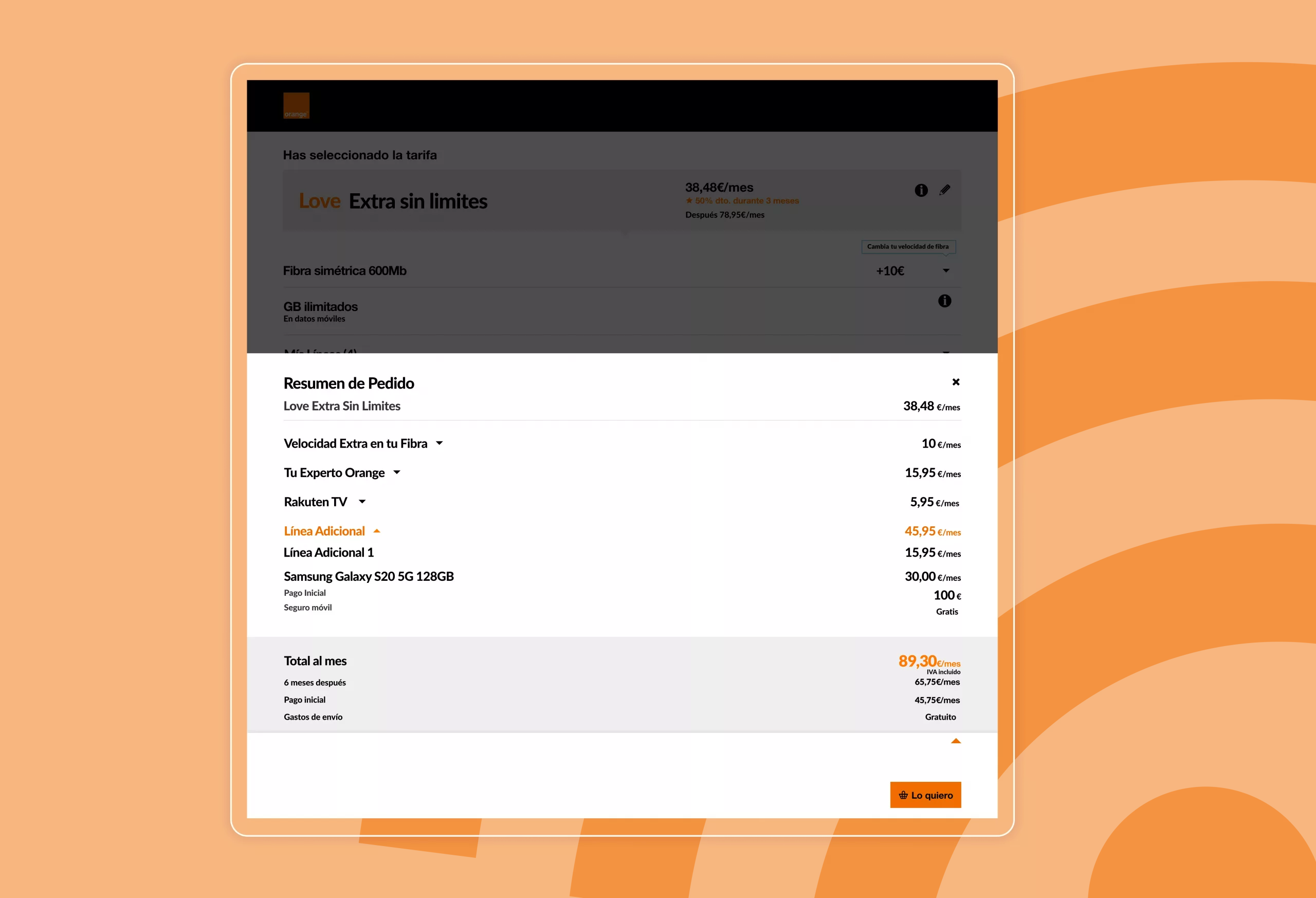
+38% increase in direct traffic +26.12% more viewed screens –30.97% reduction in bounce rate
 Final reflections
This was one of the most challenging projects due to the number of stakeholders, legacy systems, and the need to adapt two different carts simultaneously. Breaking the project into MVPs allowed us to release improvements progressively while maintaining consistency across devices. In the end, we achieved a more intuitive, coherent, and user-centered experience that significantly improved performance and customer satisfaction.